Linguaї App and Responsive Website Case Study

Project overview
The product:
Linguaї is a language-learning app and responsive website designed to help adult foreign language learners affected by war in Ukraine stay motivated and connected through accessible learning activities and peer support.
Project duration:
July 2025 - December 2025
My role:
UX Designer (Course Project)
The problem:
Adult learners affected by the war in Ukraine often study under unstable conditions—irregular schedules, limited internet access, power outages, and high stress. Existing language-learning tools rarely offer the flexibility, accessibility, or real-life speaking support these learners need to stay motivated and make progress.
The goal:
Design a simple, accessible language-learning experience that supports short, low-stress practice and meaningful peer connection even with limited time, focus, or connectivity.

Understanding the User
User research: summary
Building on earlier research with adult Ukrainian learners, I conducted additional interviews with underrepresented groups, including older adults, learners with disabilities, and those with unstable internet access or living near conflict zones.
The research revealed that learners’ needs vary widely depending on age, abilities, routines, and environment, shifting my focus toward a more flexible and inclusive design that adapts to different levels of access, focus, and emotional load.
User research: paint points
-
Lack of accessible content for learners with diverse needs
-
Limited time and energy
-
Overly long lessons with unclear structure
-
Lack of flexibility and overly repetitive tasks
-
Inconsistent power/internet and limited access to devices
-
Lack of real-life opportunities to practice speaking


While I explored five personas, the solution was ultimately optimized around the needs of Oleh and Halyna. I narrowed my focus to these two because their situations highlight core constraints—mobile-only use, accessibility needs, and unstable internet—that strongly shaped the MVP (minimum viable product). The remaining personas, Anna, Yakiv, and Maryna, were placed in the “Future Steps” section. Their needs will guide later iterations, ensuring the product continues to evolve into an inclusive tool for diverse language learners affected by conflict, trauma, or disability.

Starting the design
Paper wireframes
Early sketches focused on balancing structure, accessibility, and flexibility for two core personas, exploring navigation, activity length, and offline learning through multiple iterations.


Digital wireframes
Digital designs refined layout, hierarchy, and interactions, prioritizing clarity, low cognitive load, and accessibility informed by research and competitor analysis.

Personalized onboarding: short quiz adapts lessons to goals, time availability, accessibility needs, and learning preferences.

Low-stress lesson flow: clear progress indicators, optional revision stages, and flexible navigation support different energy levels and time constraints.

Accessibility-led refinements: icons are paired with text labels to improve clarity.

Flexible practice & connection: users can choose practice types, access targeted revision, and connect with peers using filtered partner search.
Low-fidelity prototype
Interactive prototype — best viewed on desktop
Usability study: key findings & recommendations
Goal:
This usability study evaluated how easily learners could complete lessons and connect with peers under realistic, often high-stress conditions. The focus was on identifying friction points, confusion, and unmet needs, and on ensuring the experience felt calm, intuitive, and supportive.
Key findings
-
Users struggled to access footer navigation during lessons, limiting their ability to move between key areas of the app.
-
Learners wanted the option to skip revision and proceed to the next lesson when short on time or energy.
-
Too many audio icons created visual clutter and increased cognitive load.
-
Some users confused in-lesson 'practice' with optional extra practice activities.
-
The absence of peer search filters made it difficult to find suitable conversation partners.
-
Icon-only navigation caused confusion, particularly in the footer.
Design recommendations
-
Keep global footer navigation visible and accessible during lessons.
-
Add a clear option to skip revision and move directly to the next lesson.
-
Reduce visual clutter by limiting audio icons and relying on screen reader support.
-
Clearly differentiate lesson stages from optional practice activities through labeling.
-
Introduce filters for peer search (e.g., level, lesson progress, location).
-
Pair icons with text labels to improve clarity and accessibility.
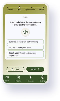
Refining the design
Mockups
While creating the mockups for Linguaї, I focused on translating usability study findings into clear design improvements and refining the experience to better support my user personas. Key updates addressed navigation access during lessons, flexibility for time-constrained learners, clearer labeling, and improved filtering.
I iterated on the mockups to ensure the app feels intuitive, practical, and supportive in real-world use. Visual decisions (color, typography, and spacing) were guided by the app’s name (from the Ukrainian word “hai,” meaning a grove) and aimed to create a calm, accessible, and non-distracting learning environment.

Usability-driven design improvements
Before → After (app)


Ensured the footer navigation remains visible and easily accessible during lessons.
Added a clear option to skip the revision stage and move directly to the lesson feedback.
Reduced visual clutter by limiting the number of audio icons and relying on full screen reader compatibility instead.
Before → After (website)
Paired icons with text labels to improve clarity and reduce confusion for users with different accessibility needs.


Introduced peer search filters to help users find relevant conversation partners more efficiently.


High-fidelity prototype (app)
Interactive prototype — best viewed on desktop
High-fidelity prototype (website)
Interactive prototype — best viewed on desktop
Accessibility considerations
Accessibility was a core design principle for Linguaї, balanced carefully to remain realistic for a capstone project. The goal was to create a calm, inclusive experience that reduces cognitive load without overcomplicating the interface.
For users with low vision or memory challenges:
-
High-contrast color choices and legible icon sizes
-
Short, clear instructions with frequent opportunities for revision
-
Text labels paired with icons to improve clarity and reduce ambiguity
-
Calm, predictable layouts without clutter or time pressure
-
Customization options in settings to support individual needs
For users under stress or short on time:
-
Bite-sized lessons designed for flexible, on-the-go learning
-
Simple task flows with minimal cognitive overhead
-
Onboarding preferences quiz and adjustable settings to personalize pace, reminders, and focus
Localization:
-
While this case study is presented in English, the app is designed with localization in mind.
For users in Ukraine, the default interface language would be Ukrainian, with clear language-switching options.
Going forward
Impact
Linguaї is designed to make language learning, especially speaking practice, more accessible for adults living in high-stress or unstable conditions. By prioritizing flexibility, offline access, and personalization, the app aims to support learners who are often underserved by traditional, one-size-fits-all language platforms.
What I learned
This project reinforced how closely UX design is tied to real-life constraints, not ideal user behavior. Designing for learners facing stress, limited access, or accessibility challenges pushed me to focus on reducing friction rather than adding features. I learned that small decisions, like allowing users to skip steps, supporting offline use, or simplifying lesson structure, can have an outsized impact on motivation, confidence, and follow-through.
Next steps
-
Moderated usability testing: Conduct a moderated study to observe how users interact with the refined designs, allowing for real-time follow-up questions and deeper insight into remaining friction points.
-
Deeper accessibility exploration: Expand research into cognitive and trauma-informed accessibility to better support users affected by stress, disability, or unstable living conditions.