Mia Wine App and Responsive Website Case Study

Project overview
The product:
Mia Wine is a mobile application designed to help the customers of Mia Wine place orders online and pay for them through the app, then pick them up at a convenient time.
This was created as part of a class project for the Figma UI UX Design Essentials course on Udemy.
Timeline:
October 2023
My role:
UI/UX designer (Course Project)
Market Research
-
Online delivery apps are becoming more and more popular.
-
A report from the Last Mile Experts notes that “the e-commerce sales value will reach the level from 2020 by the end of 2023 and exceed the record, pandemic level from 2021 in 2024.”
-
According to the Allied Market Research, “The penetration of smartphones and the increase in usage of mobile shopping apps have surged the online delivery business of alcohol selling companies. Millennials are considered to be most tech savvy and thus support the growth of the online delivery of alcohol market.”
-
According to Oleksiy Taranenko, Director of Development of Nova Post (currently, the largest courier shipment operator in Ukraine): “There are 30 million active consumers in Ukraine. Ukrainians have started to buy online even more frequently than before the war, because not all offline stores have been able to retrieve and replenish their stocks on time. This is a strong incentive for the development of e-commerce and express shipping.”
Early Ideation
I analyzed several online stores and two wine delivery apps. Since my ideal customer is very Eco/Environment/Waste conscious, most of the online stores I looked at were related to ethical and sustainable consumption, promoting green living and a healthy lifestyle. I looked at the designs, color schemes, overall aesthetic, compared the user experience of each app, and juxtaposed the positive and negative comments from the App Store to get the essence of what the users look for in a good app.
-
Simple, modern and clean design, high contrast ratio
-
Clear brand identity (colors, logo, typeface, style, photography…)
-
Easy to navigate
-
Smooth ordering process
-
Absence of ads

User Persona
I generated a user persona using randomprojectgenerator.com to help me identify the target audience, understand the user better, explore their needs, and design the app with specific target users in mind.

User Journey
Next, I created a user journey map to help me visualize how a customer might interact with Mia WIne and identify the pain points and feelings the customers of Mia Wine might experience while using the app.

Wireframes
Here is what my initial wireframes looked like before I conducted user testing and made changes to the user flow and overall design.

Low-Fidelity Prototype
Interactive prototype — best viewed on desktop
Style Guide
Once the lo-fi prototype was updated, I went on to choose the colors and the typeface for the app using the moodboard above for inspiration and ideas. I created a simple UI style guide for consistency.

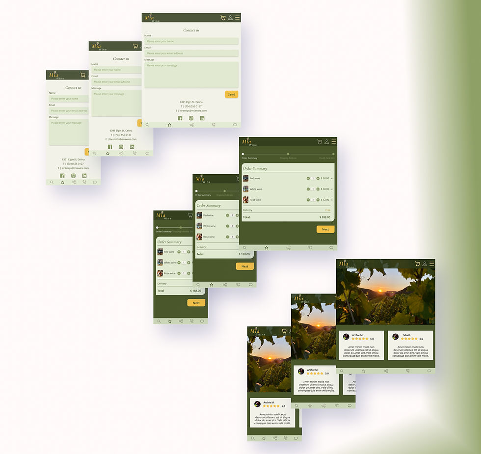
High-Fidelity Design
The design went through quite a number of changes:
-
The very first version looked incomplete, some essential screens were missing, so I made the necessary changes to the user flow.
-
I also experimented with the color scheme, making the necessary changes to choose the colors that are strongly associated with nature, sustainability, but also peace, harmony and tranquility. Due to the current situation in Ukraine, it seemed appropriate to focus on those colors rather than choose the traditional reds often associated with violence, danger, and bloodshed.
-
Next, I conducted basic user tests. To receive feedback from several different points of view, I turned to a UI/UX designer, a QA engineer, an illustrator, and 2 people with no experience in design. I didn’t create any research plans or script, just a few tasks and questions about their overall experience with the app. I used Figma’s prototype mirror share app and asked the users to share their thought process and tell me if anything was unclear/not functioning properly and if there was anything they would change in the app (from typeface/colors/buttons/spacing to the overall user experience on each screen).
Here are the changes I made as a result of the user testing:

Alignment, Grid, and Auto Layout
Since I was learning and creating the designs at the same time, the newly acquired knowledge about constraints, auto layout and grids from the Figma Auto Layout, Constraints and Breakpoints course on Udemy made me reconsider some of the previously created screens. I had to change them to ensure they were fully responsive.
High-Fidelity Prototype
Interactive prototype — best viewed on desktop
Project Summary
During this project, I conducted basic market research, created low-fidelity wireframes, and iterated them into high-fidelity designs. I tested responsiveness across screen sizes, explored basic animations and prototyping, and ran basic user testing. The process strengthened my end-to-end design skills and highlighted opportunities for future growth.
Thank you for taking the time to review this case study. I welcome any feedback or questions.