InGoodTime App and Responsive Website Case Study
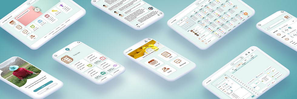
Project overview
The product:
InGoodTime is a family schedule-management app that helps busy working parents coordinate personal and family commitments in one place—from school drop-offs and activities to work meetings—so everyday planning feels simpler and more manageable.
Project duration:
January 2024 - October 2024
My role:
UX Designer (Course Project)
The problem:
Managing a family schedule is overwhelming. Parents juggle work, school, activities, and appointments, while many existing tools feel too complex or too rigid for real family life. As a result, staying organized often adds stress instead of reducing it.
The goal:
InGoodTime aims to reduce the chaos of family scheduling through an intuitive, flexible experience. Features such as task management, personalized reminders, and clear navigation help parents stay organized with less effort—freeing up time and mental space for what matters most: family time.

Understanding the User
User research: summary
I conducted a screener survey and remote video interviews with five parents from diverse backgrounds, including a neurodivergent participant and a user of assistive technology. While I initially assumed parents needed a simple scheduling tool, the research revealed more nuanced challenges shaped by different routines, cognitive needs, and devices. These insights pushed me to design for flexibility, accessibility, and reduced mental load.
User research: paint points
-
Overwhelming schedules
-
Lack of cross-device syncing
-
Difficulty prioritizing tasks
-
Visual overload in existing apps


Starting the design
Paper wireframes
I began with paper wireframes to explore solutions for the diverse needs of my three personas. Each sketch focused on balancing structure and flexibility, from managing work and family tasks to coordinating shared schedules. Through multiple iterations (around five per screen), I tested layouts that supported both detailed planning and quick checklists.
I also explored screen-size variations early on to ensure layouts remained clear, readable, and consistent across mobile, tablet, and desktop.


Digital wireframes
The digital wireframes built on these paper explorations, refining layouts, navigation, and accessibility across devices. I combined insights from user research and competitor analysis to create a cohesive, responsive experience. This phase focused on simplifying interactions while keeping user needs front and center, so the product feels intuitive, flexible, and reliable across all screen sizes.

4 large buttons (Calendar, Lists, Settings, Messenger): These provide users with quick, intuitive access to core features. Lists offer a no-pressure alternative for users like Nadiia who prefer to plan without strict time blocks.

Round "plus" button: To easily create new events or to-do lists, which keeps things fluid. Users like Bjorn can quickly add tasks on the go without feeling bogged down by complexity.

Full month view: Squeezing the month onto one screen gives users the ability to plan ahead. Though it might seem overwhelming, the use of icons and short event titles makes it manageable for users like Neelam who need to see the big picture.

Event customization options: Allows users to personalize or visually identify events, customize reminders and add extra details, improving both accessibility and organization.

Syncing across devices ensures a smooth transition from mobile to desktop, making the app adaptable to whatever device the user happens to be on at any moment.
Digital wireframe screen size variations

The main goal at this stage was to refine the layout in a way that felt intuitive, clear, and responsive—without losing sight of what the user personas actually needed. I aimed to keep the navigation simple and the visual structure consistent, even when certain features had to shift or scale depending on the screen size.
Admittedly, staying consistent across multiple devices was a challenge. There were moments when I had to rethink spacing, simplify components, or adjust the hierarchy just to keep things coherent. But the challenge pushed me to be more intentional and flexible with my design decisions—and it definitely helped me grow as a designer.
This phase reminded me that responsive design isn’t just about shrinking or stretching screens; it’s about preserving the experience and making sure it still feels familiar and supportive, no matter where or how someone is accessing the site.
Low-fidelity prototype (app)
Interactive prototype — best viewed on desktop
Low-fidelity prototype (website)
Interactive prototype — best viewed on desktop
Usability study: key findings & recommendations
Goal:
This usability study evaluated how easily parents could create and manage events and to-do lists in the InGoodTime app. The focus was on identifying friction points, confusion, and unmet needs, and on ensuring the experience felt intuitive, flexible, and supportive of real-life family scheduling.
Key findings
-
Some users confused events with to-do lists, indicating unclear differentiation.
-
Too many options during task creation caused cognitive overload.
-
The “Create event” action was not immediately visible or intuitive.
-
Users wanted private events and lists not shared with the whole family.
-
Editing family members caused frustration.
-
Users expected quick ways to repeat or copy recurring tasks.
-
The current date or week was not clearly highlighted in the calendar view.
-
Icon and color selections lacked clear feedback, causing uncertainty.
-
No confirmation appeared after saving events or lists, leaving users unsure if actions were successful.
Design recommendations
-
Simplify task creation by progressively revealing options.
-
Clearly differentiate events from to-do lists through visuals and labels.
-
Make primary actions (e.g. “Create event”) more prominent.
-
Improve family management flows, including inviting and editing members.
-
Add options for private events and lists.
-
Support repeating and copying tasks for recurring activities.
-
Strengthen visual feedback (active states, confirmations, current date indicators).
Refining the design
Mockups
While creating the mockups for InGoodTime, I was focused on addressing the key findings from the first usability study and refining the app to meet the needs and preferences of the user personas. I aimed to create a more intuitive experience for managing family schedules, keeping in mind the feedback on usability issues such as finding family members, differentiating between events and to-do lists, and simplifying the steps to create and manage tasks.
The goal was to continuously refine the mockups to align with users' expectations and ensure that the app was both functional and convenient.

Usability-driven design improvements
Before → After (app)


Strengthened visual feedback when selecting colors.


Simplified date and time selection, added visual feedback when selecting icons.
Before → After (website)
Made the current date easier to identify.


Added a visual confirmation after saving tasks and events.


High-fidelity prototype (app)
Interactive prototype — best viewed on desktop
High-fidelity prototype (website)
Interactive prototype — best viewed on desktop
Accessibility considerations
Accessibility was a core design principle for InGoodTime, balanced carefully to remain realistic for a student case study. The goal was to create a calm, inclusive experience that reduces cognitive load while supporting different planning styles, devices, and abilities.
For users with dyslexia or reading challenges:
-
Short, simple text paired with icons and visual cues
-
Avoidance of harsh color contrast and dense text blocks
-
Visual-first interfaces (icons, color coding, timelines)
-
Settings option reserved for future readability tools and customization
For users with ADHD or cognitive overload:
-
Clean, minimal layouts without pop-ups, flashing elements, or motion-heavy UI
-
Clear navigation and predictable interaction patterns
-
Reminders designed to support, not interrupt
-
Flexible planning options (events, lists, all-day tasks)
For users relying on assistive technology (website):
-
Logical keyboard navigation and visible focus indicators
-
Clear content hierarchy using structured headings
-
Semantic labels and annotations to support screen readers
-
Interaction feedback for selections and saved actions
General accessibility principles:
-
Plain language and clear prompts throughout
-
Color never used as the only indicator of meaning
-
Consistent layouts across screen sizes
-
Sufficient spacing between interactive elements
-
Subtle, non-distracting animations only when helpful
Design system (process note)
While designing the responsive website, I built my first structured design system to improve consistency and scalability across mobile and desktop. I standardized components, typography, color usage, iconography, and elevation rules. Although still a work in progress, this system helped streamline iteration, maintain visual consistency, and deepen my understanding of scalable UI design.


Going forward
Impact
InGoodTime is designed to help busy parents reduce the stress of family scheduling by offering an accessible, flexible, and cross-device experience. If released, the app and responsive website could improve coordination, reduce mental load, and better support users who are often underserved by rigid scheduling tools.
What I learned
This project strengthened my understanding of accessibility, iteration, and user-centered decision-making. I learned that inclusive design doesn’t require more features, it requires clearer ones. Small choices around structure, feedback, and flexibility can have a meaningful impact on how supported users feel.
Next steps
-
Conduct additional unmoderated usability testing on refined designs
-
Run focused accessibility research with users of assistive technologies
-
Gather post-launch feedback (hypothetical) to guide long-term iteration